
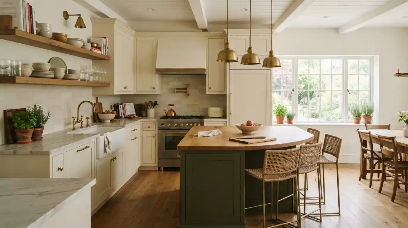
My aunt painted her kitchen cabinets bright white back in 2019. Everyone was doing the all white thing then, and she wanted in. Loved it for maybe two years. Then it started reading cold, almost like a lab, especially against her gray countertops. She’s repainting again this spring, warm greige this time, and she told me straight up she wishes somebody had warned her that trend colors don’t age the way you think they will while you’re picking the swatch.
That’s basically the whole story with kitchen cabinet ideas. Something gorgeous in a magazine spread can feel completely off in your own kitchen a few years later, especially if nobody actually checked it against your light or your countertops first.
Why Some Kitchen Cabinet Colors Age Well and Others Don’t
A cabinet color can look stunning in a showroom photo and still feel wrong once it’s sitting in your kitchen year after year. Usually it comes down to one thing. Was the color picked for the room, or picked because it was everywhere that season.
Warm Neutrals Are Replacing Stark White and Cool Gray
Stark white had its run. Cool gray got its turn right after. Neither one is holding up quite the way people expected a few years back. Cream, mushroom, greige, warm stone, that’s what’s filling the gap now, still clean looking but nowhere near as sterile as bright white gets. My aunt’s greige lands somewhere between beige and gray, and it’s honestly a smart pick, plays well with nearly any countertop or floor without demanding attention.
You can run this warm neutral across the whole kitchen or just up top, saving something bolder for the island underneath. It’s also just a safer bet if committing to one loud color across every door in the room makes you nervous. A friend of mine went warm off white specifically because her kitchen barely sees direct sun, and stark white was making the whole space feel flat instead of the bright thing she’d pictured. Warmth does something a cold white simply can’t, it adds a bit of depth even when the sun isn’t cooperating.
Deep Greens and Earthy Tones Are Having a Real Moment
Green comes up in almost every kitchen conversation I’ve had lately, and it’s not that bright sage everyone did a few years ago. It’s deeper now. Olive, moss, forest, tones that feel grounded rather than trendy. My cousin did her island in a deep olive last year, kept everything else cream, and the contrast alone made the whole kitchen feel more thought out. Terracotta and rust have popped up a lot too, especially in farmhouse leaning kitchens, usually next to natural stone counters and warm wood.
These earthy tones photograph well precisely because they ground a room instead of demanding a second look, which is probably why they’ve outlasted the flashier colors from a few seasons back. Green pairs beautifully with brass, or matte black if you want something starker. Either finish stops the color from reading as too playful for a kitchen you actually cook dinner in every night. Worried about commitment? Just do the island. Test it before you repaint everything.
Two Tone Cabinets and Bold Colors Worth Considering
Beyond one single color for the whole kitchen, plenty of people are mixing tones now. Lighter up top, darker down low, or one totally different shade reserved just for the island.
Why Two Tone Kitchens Keep Growing in Popularity
Two tone solves something specific, wanting a bit of color without going all in on one bold shade across every cabinet door in the room. Lighter uppers next to a deeper lower cabinet or island adds real dimension without tipping into the kind of heaviness a fully dark kitchen sometimes gets. My cousin’s cream and olive setup nails this. Cream keeps things bright and open, olive gives the eye somewhere to actually land.
This whole approach carries way less risk than one loud color everywhere, since you can repaint just the island down the road if your taste shifts. It’s also a decent way to mix materials, stained wood on the island next to painted perimeter cabinets, texture without chaos. My neighbor did this exact combo, soft warm white up top, deep navy on her island, and that navy island has quietly become the actual focal point of her whole kitchen now, more than the countertops or the backsplash ever were.
Statement Colors That Work Best in Small Doses
Navy, emerald, sapphire, ruby red, these jewel tones do better as an accent than they do covering every single cabinet in the room. My cousin actually considered a full navy kitchen at one point, then backed off, worried it’d feel heavy without enough natural light coming in. She saved the navy for her island instead, and now it reads as deliberate rather than overwhelming. Burgundy, plum, oxblood have started showing up too, deep reds that look surprisingly sharp against lighter wood and black or brass fixtures. A dark, saturated color needs a room with decent light behind it though, otherwise it just feels closed in rather than cozy.
Pair a bold color with a paler upper cabinet, or keep your countertops and walls neutral around it, and the eye actually gets somewhere to rest. A hood painted in something punchier, a sandy gold, works well here too, small dose, big impact, no full commitment required. One bold element carrying the drama while everything else stays quiet, that’s really the whole trick.
Materials, Hardware and Storage That Make Cabinets Actually Work
Color steals the spotlight, sure, but the material, finish, and hardware decisions are what actually shape how a kitchen feels once the initial excitement over a paint swatch wears off.
Wood Finishes and Textured Surfaces Worth Knowing About
Smoked oak, white oak, walnut, these have taken over from the smoother, glossier finishes that were everywhere a few years back. My aunt’s contractor pushed her toward brushed oak for the lower cabinets specifically, and that slight texture adds a warmth flat paint just can’t replicate. Matte lacquer’s picked up steam too, something softer and more tactile instead of shiny and reflective. Mixing stained wood with painted cabinets works well if you want depth without the whole room feeling cluttered, but pick one to lead.
Let the other one support quietly in the background. A friend paired a walnut island with cream painted perimeter cabinets, and that wood grain against the soft neutral feels warm without stealing focus from anything else. Fluted wood panels have shown up more on islands and range hood surrounds lately too, texture without changing the actual shape of anything.
Hardware, Storage and the Details That Age Gracefully
Brushed brass and matte black are the two finishes that just work across nearly any cabinet color, which explains why they’ve stuck around this long. My cousin went brushed brass specifically because it warmed up her cream and olive pairing without the risk of looking dated the way polished chrome eventually does. Storage matters just as much as color to people right now. Appliance garages hiding the toaster. Deep pull out drawers for pots. Vertical pantry systems using height nobody used before.
My neighbor added a walk in pantry during her last remodel purely to keep her counters clear, and she swears it made the kitchen feel bigger without adding a single square foot. Floor to ceiling cabinets have become popular too, extra storage plus the visual pull upward toward a taller ceiling. Open shelving, everywhere a few years ago, has quietly faded out in a lot of newer kitchens, replaced by hidden storage that keeps things looking calm. Whatever gets chosen, the same question applies to hardware and storage that applies to paint. Will this still feel right in five years, or is it just what’s trending this particular season.
Conclusion
My aunt’s cold white kitchen and my cousin’s cream and olive combo really sum this whole thing up. Pick a color because it’s trending this month, and there’s a decent chance it feels wrong in three years. Pick one that actually matches your light, your countertops, how you use the room, and it holds up a lot longer. Warm neutrals, earthy greens, a two tone setup with one bold accent, all of it gives you room for personality without gambling the whole kitchen on something that could look dated by the time you’re ready to sell.
Wood finish, hardware, storage, get those right too, since those quiet details end up mattering just as much as the paint color once the excitement of picking it wears off.
Frequently Asked Questions
No, white cabinets aren’t out, but the stark, cool white that dominated for years is giving way to warmer whites and creamy off-whites. Pairing white with natural wood accents or a bolder color on the island keeps the look feeling current rather than dated.
Yes, and it’s a popular way to add depth without overwhelming the room. This combination generally works best when one finish leads visually, wood or paint, while the other plays a supporting role rather than competing equally for attention.
Brushed brass and matte black both pair beautifully with green cabinets, whether that’s olive, moss, or a deeper forest tone. Either finish adds warmth or contrast without making the color feel too casual or too formal for daily use.