
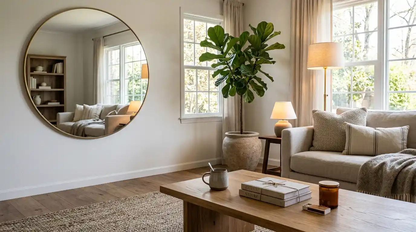
You don’t need a designer’s budget to get a room that actually looks designed. What DrHomey interior design content circles back to, over and over, is basically the same idea: intentionality reads as luxury way more reliably than price tag ever does. This piece walks through the specific, checkable tactics that separate a “furnished” room from a “collected” one layered lighting instead of one harsh overhead bulb, mirror placement that actually expands a space rather than just decorating it, and the wood-tone mixing rule most people get completely backward.
None of it needs a full renovation or designer-level spending. Just knowing which few details actually carry the visual weight, and honestly, which ones you can safely just ignore.
Why Intentionality Beats Price, Basically Every Time
The gap between a room that looks expensive and one that looks cheap has surprisingly little to do with how much actually got spent on furniture. It has everything to do with whether choices were made on purpose or just accumulated by accident, one at a time. One solid piece chosen with real intention beats three mismatched things bought on sale, almost always.
This shows up most clearly in material choices, honestly. Solid wood, natural stone, and metal read as higher-end than plastic or particle board regardless of brand name, and that difference shows up even in photos, not just up close in person. A secondhand oak table with a fresh finish will consistently look more expensive than a brand-new flat-pack desk, since the material itself carries visual weight that no amount of clean construction can fake. Chasing trends actively works against this too following whatever’s popular online tends to date a room within a year or two, while choices built around how you actually live in a space just age better, full stop.
So what actually makes a home look expensive without a big budget behind it? Material choice and restraint matter more than total spend solid wood, stone, and natural textiles consistently read as higher-end than synthetic alternatives, even at a noticeably lower price point. Decluttering surfaces and grouping whatever’s left into small, intentional clusters, three items instead of ten scattered ones, does more visual work than most people expect from something that costs literally nothing.
Lighting Is the Cheapest Transformation You’ve Got
Of every tool available for changing how a room feels, lighting is the one that costs the least and does the most, by a wide margin. A dark or flatly lit room reads as small and cheap no matter what furniture sits inside it, while that same room with layered, warm lighting can feel noticeably larger and more finished within minutes. Genuinely minutes.
The most common mistake is relying entirely on one strong overhead fixture, which creates flat, harsh shadows sometimes called the “stadium look,” and once you notice it you can’t unsee it. A better approach layers three distinct sources: ambient lighting for general use, task lighting focused on one specific activity like reading or working, and accent lighting small table or floor lamps creating warmer pockets of light in corners an overhead fixture just can’t reach. Bulb color temperature matters too. Warm white bulbs, generally around 2700K, flatter furnishings and skin tones far more than cooler daylight-toned bulbs, which can make a space feel clinical instead of inviting.
What color temperature actually looks most expensive, then? Warm white, around 2700K, is widely favored in higher-end interiors because it mimics the warm glow of natural evening light rather than a cooler, more clinical white. Save the cooler-toned bulbs for task-focused areas a home office, a kitchen prep zone where visual clarity actually matters more than ambiance does.
Mirrors Do More Than Just Decorate
For smaller spaces specifically, a well-placed mirror solves two problems at once it works as wall art while also tricking the eye into reading the room as larger than its actual square footage. That dual function is exactly why mirrors show up so consistently in small-space advice, regardless of style or budget level, decade after decade.
Positioning a large mirror directly across from a window maximizes the effect, since it catches natural light and throws it back into the room’s darker corners instead of just bouncing off a blank wall somewhere. Shape matters too since most furniture reads as rectangular, a round mirror breaks up that repetition and reads as more balanced against a room full of straight lines. For a more relaxed, lived-in feel rather than something formal, leaning a tall floor mirror against a wall instead of mounting it adds visual height while feeling considerably less staged, less “showroom.”
Where should you actually place a mirror to make a room look bigger? Directly across from a window is the highest-impact spot, since it reflects the most available natural light back into the room rather than into a wall or dead corner nobody looks at. This one placement decision does more to visually expand a space than the mirror’s size or frame style ultimately ever does.
Furniture Scale Matters More Than Furniture Style
Furniture choice is where a lot of otherwise well decorated rooms fall apart, and it’s rarely actually a style problem. It’s a scale problem, almost always. An oversized sectional in a small apartment reads as suffocating no matter how nice the fabric is, and a too-small rug floating in a large room reads as an afterthought regardless of how good the quality is.
A useful gut check here sometimes called the walk-through rule: there should be enough open floor space to move through a room comfortably, without navigating around furniture like an obstacle course. If you’re routinely dodging pieces just to reach another part of a room, that’s a layout problem to fix before anything else about the styling even matters. Multifunctional furniture ottomans with hidden storage, low-profile sofas that don’t block sightlines helps smaller spaces stay organized too, and an organized room reads as more expensive than a cluttered one almost automatically. Independent of what’s actually in it, weirdly.
How do you know if your furniture’s genuinely the wrong size for your room? If you have to navigate around it to move through comfortably, the pieces are probably too large for the space. A well-scaled room lets you walk from one point to another without weaving between chairs or tables, leaving enough open floor sometimes called “white space” for the room to feel organized instead of cramped.
The Wood-Tone Rule Most People Get Backward
A common decorating myth holds that every piece of wood in a room needs to match the exact same shade. In practice, mixing wood finishes on purpose tends to look more curated than forcing everything into one uniform tone provided the mixing follows one specific rule, that is.
The trick is matching temperature, not color. If your flooring has a warm, reddish undertone, choose furniture with similarly warm undertones, cherry or walnut say, rather than chasing the exact same shade. When a dark wood table sits directly against dark wood flooring, the two tend to visually blur together and read as heavy rather than intentional. A neutral, light-colored rug placed between them creates a visual break that makes the tonal difference look like a deliberate choice instead of a mismatch nobody planned. This same logic, incidentally, makes vintage and secondhand wood furniture considerably easier to mix into an existing room than people typically assume going in.
Should all the wood furniture in a room actually match? No matching every piece to the exact same shade often reads as generic instead of curated. Matching warm-to-warm or cool-to-cool undertones, rather than forcing an identical finish across everything, tends to produce a look that feels more collected over time.
Conclusion
DrHomey interior design content keeps circling back to the same underlying principle, over and over: deliberate choices about light, scale, and material consistently beat simply spending more money. Layer your lighting instead of relying on one overhead fixture, place mirrors where they’ll actually reflect usable light, respect furniture scale before worrying about style at all, and mix wood tones by temperature rather than forcing an exact match. None of these changes needs a renovation budget. Just a clearer sense of which details are actually doing the visual work in a room, and which ones aren’t.
FAQs
Yes a lot of the core guidance, including mirror placement, layered lighting, and multifunctional furniture, is specifically aimed at making smaller spaces feel larger and more organized. These techniques don’t need a large footprint to work and often matter more in compact rooms than spacious ones.
Focus on lighting layers, natural materials over synthetic ones, and decluttering surfaces down to small, intentional groupings rather than scattered objects. Hardware upgrades on cabinets and consistent, high-quality textiles are also low-cost changes that make an outsized visual difference relative to their price.
Buying furniture that’s the wrong scale for the space is one of the most common and most visible mistakes, since an oversized piece makes even a well-decorated room feel cramped. Prioritize leaving enough open floor space to move through a room comfortably before focusing on style or color choices at all.
Yes, when used deliberately rather than scattered in small plastic pots one large, dramatic plant in a ceramic or stone container reads as considerably more intentional than several small ones in generic nursery containers. The weight and material of the container matters almost as much as the plant itself for pulling that effect off.