
I’ve walked into rooms that had everything the right sofa, the right rug, the walls painted exactly the colour the designer recommended and still felt like something was off. Not wrong exactly. Just unfinished. Like the room was waiting for something nobody could name. That feeling has a cause, and once you know what it is, you can’t unsee it. The furniture is there. The decor isn’t talking.
That’s the gap home decor styling closes. And it’s a different skill set than buying furniture or choosing paint. DrHomey’s home styling work lives entirely in that gap the part of a room that most homeowners hand over to instinct and most instincts get slightly wrong.
The numbers behind this are worth knowing. The global home decor market was valued at $862.18 billion in 2026. By 2034 it’s projected to reach $1,299.88 billion a 5.27% CAGR that tells you people are not slowing down on their homes. Europe alone is at $218.49 billion in 2026. The U.S. home decor market sits at $41.49 billion this year and climbs toward $305.51 billion by 2032. That’s an enormous amount of spending. A portion of it lands badly not because the products are wrong, but because the styling logic that makes products work together was never applied. That’s the problem DrHomey exists to fix.
Why Most Rooms Feel Off — and What Vignette Styling Actually Does
Here’s something I’ve noticed over years of room styling work: people add things to rooms to make them feel done. That’s the instinct. A room feels bare, so something goes on the shelf. Something goes on the coffee table. A few throw pillows get added to the sofa. And the room still feels off but now it’s also crowded.
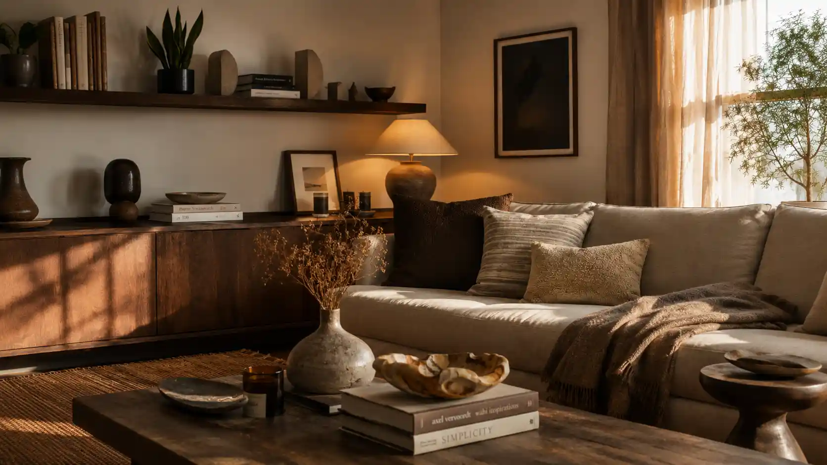
The issue is that adding and styling are not the same thing. Styling is about relationship between objects. A ceramic vase sitting alone on a sideboard, with breathing room on either side, reads as a deliberate choice. That same vase surrounded by six other things of similar height reads as a pile. Negative space is doing real work in a room it’s the pause that lets everything around it register properly. Most people treat it as a mistake to be filled.
Vignette styling is the formal name for what good home accessorizing actually looks like. A vignette is a small composed scene on a coffee table, a mantelpiece, a console table, a nightstand, a dresser top. The rule of three governs most of them: odd number groupings read more naturally to the eye than even ones. Three objects, five objects, seven never four, never six. Within the grouping, staggered heights create movement. A stack of coffee table books as the base layer, a sculptural bowl to one side, a bud vase with dried botanicals finishing the corner. Nothing touching. A quarter of the surface left completely clear.
Shelf styling runs on the same logic but over a longer surface, so the stakes for getting it wrong are higher. Bookcase styling that works alternates upright books with horizontally stacked books, breaks rows with a sculptural object or a small indoor plant, leaves gaps that the eye reads as rhythm rather than absence. Pothos for low-light shelves. A snake plant in a corner where height is needed. Bookends that echo the material of something else in the room a rattan bookend against a rattan planter two shelves down.
Proportion, scale, balance, rhythm these aren’t abstract. They’re what you’re adjusting every time you move something two inches to the left and the whole surface suddenly looks better. DrHomey’s decorating consultation process maps all of this before a single purchase is made, because the sequence matters. Get the logic right first, and the objects fill it. Reverse the sequence and you’re arranging chaos.
Color Drenching, Texture Layering, and the Pattern Logic Behind 2026’s Biggest Styling Shifts
There’s a version of home decor styling that’s mostly swapping accessories seasonally and calling it done. That’s seasonal decor styling and it’s genuinely useful but it sits on top of something more structural, which is the colour and texture framework the room is built on. Get that framework wrong and no amount of new throw pillows fixes it. Get it right and the room absorbs changes without losing coherence.
The colour palette framework DrHomey works with has three tiers. Dominant color sets the room’s character walls, large upholstery, flooring. Secondary color supports it without competing drapery, curtains, the main area rug. Accent color is where personality enters: a jewel tone in scatter cushions, a saturated color in framed prints, a pop of color in a ceramic vase that echoes something in the rug. Miss that sequence and what you get is a color scheme that looks like separate decisions. Follow it and you get a color story something that reads as intentional from the doorway.
Color drenching is the furthest commitment in this direction. Walls, ceiling paint, baseboards, trim color, sometimes the furniture all in the same tone, or close enough that the eye reads them as one continuous surface. The cocoon effect this creates is real and surprisingly calming. In warm neutrals and earthy tones it feels like a room that’s exhaling. In moody tones deep burgundy, chocolate brown, Transformative Teal from Pantone it feels like a room that has a point of view. Color drenching 2026 is showing up across both American revival interiors and contemporary European design specifically because it runs counter to the fast-decor disposability trend. It’s a committed choice, not a seasonal one. That matters: 62% of Millennials and 62% of Gen Z are actively choosing sustainable decor and eco-friendly home decor, and wraparound color is, among other things, a way of making a space feel permanent rather than provisional.
Stripe drenching and pattern drenching are the louder relatives. Pattern drenching layering chintz, toile, herringbone, block print, heritage print across walls, upholstery, and window treatments has been resurfacing through eclecticism and the Edwardian revival thread running through 2026 design. It works when there’s a lead pattern setting the scale and complementary patterns layering in at different scales underneath. A large-scale wallpaper print. A quieter pinstripe on the roman shade. Solid upholstery. Then the pattern returns in scatter cushions and a textile hanging. The purposeful arrangement keeps it from becoming visual clutter which is always the line between maximalism that works and maximalism that exhausts.
Texture layering sits underneath all of this and is often what separates rooms that feel good in person from rooms that photograph well but feel flat to be in. Velvet against linen. Bouclé on a reading chair next to a smooth painted wall. Wicker and rattan against a cool plaster surface. Wool and cotton layered on a bed with a linen throw folded at the foot. Corduroy cushion covers against a sideboard with an antique brass finish. The eye reads texture as warmth. The body feels it differently than it feels a room with one dominant material even if it can’t name what changed.
The European Federation of Textile and Furnishing Industries tracked something worth paying attention to: the average lifespan of decorative cushions dropped from 5.2 years in 2015 to 2.1 years in 2025. That’s fast decor eating into quality. DrHomey consistently pushes toward natural fiber, performance fabrics, stain-resistant fabric, hypoallergenic textiles, and temperature-regulating textiles not as a moral position but as a practical one. A well-chosen soft furnishing that lasts eight years is not more expensive than three cheap ones over the same period. It’s cheaper, and it looks significantly better by year three.
Lighting and the Room Surfaces That Change Everything After Dark
Most rooms have one lighting source doing three jobs badly. A ceiling fixture providing ambient lighting that’s either too bright for evening or too dim for task work, with nothing in between. The fix isn’t complicated, but it requires treating lighting as a styling decision rather than a utility one.
Layered lighting ambient lighting as the base, accent lighting defining the focal point, task lighting at the functional zones is the framework. A table lamp on a nightstand changes a bedroom more than almost any other single addition. A sconce on a dimmer switch shifts a living room from daytime space to evening space without anything moving. Cordless rechargeable lights and cordless lamp options have genuinely changed what’s possible a mantelpiece, a bookshelf top, a windowsill, a reading nook corner that previously sat dark now becomes a styled surface with its own light source and its own moment.
Picture lights over wall art are probably the most underused tool in residential styling. A framed print on a wall is decoration. The same print with a picture light over it is a focal point. The room organises itself around it differently. Mood lighting in general is what makes a styled room feel inhabited rather than displayed and candle light is still the version of that no LED bulb has fully replaced. Taper candles in a candle grouping on a dining room sideboard. Tealight candles inside a tray styling arrangement on a coffee table. A scented candle and diffuser at the entryway carrying a signature scent that the room is associated with before anyone consciously registers the decor.
Light temperature matters in a way that most non-designers underestimate. A warm bulb in a table lamp makes the earthy tones and warm neutrals in a room glow. A cool bulb in the same lamp flattens them. Circadian rhythm lighting warmer in the evening, cooler during working hours is now accessible enough in LED lighting and smart bulb form that there’s no practical reason not to use it in a home office styling or bedroom setup.
Seasonal Refresh and the Fast-Moving Trend Landscape DrHomey Watches
Pinterest has 600 million monthly users and their 2026 trend data is specific: circus interior searches up 130%, alien core aesthetic searches up 80%, striped ceiling interest up 40%. Trends are evolving four times faster than they did seven years ago. That pace is not an invitation to chase every trend. It’s an argument for building rooms on principles durable enough to absorb new elements without needing to be rebuilt from scratch.
A room refresh done well DrHomey’s room refresh service approach works at the level of the mantelpiece, the bookshelf, the dresser top, the bathroom vanity, the porch styling, the outdoor living space that most people abandon in autumn. Swap the blanket throw from a cotton weight to wool. Change cushion covers from pastel hues to the chocolate brown and soft grays that dominate 2026. Move a plant from a corner to a windowsill. Restyle the floating shelf the plant left behind. These are sequential small decisions that produce a room that reads as genuinely updated without a contractor, without a budget worth noting, without touching the furniture at all.
The home textiles and floor coverings segment is projected at a 9.4% CAGR through 2033. The decorative pillow market sits at $4.06 billion in 2025. The floor covering market is at $101.28 billion. These numbers are not about luxury upper middle income holds 42.3% of the global market share. They’re about ordinary homeowners deciding, in large numbers, that the textiles and accessories in their rooms matter. DrHomey’s home decor styling work whether that’s a full style consultation, a one-off decorating consultation, or an e-styling package for a single room starts from the same position every time: the room already has most of what it needs. The styling logic is what it’s missing.

8 thoughts on “Home Decor Styling by DrHomey”